We believe the new look better matches what we’ve become since 2004: a growing Mixed Used and commercial partner leading clients to superior design solutions by listening first and delivering simple, efficient designs that maximize the potential of your space.
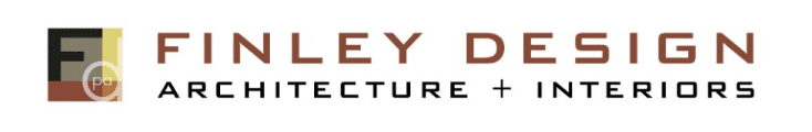
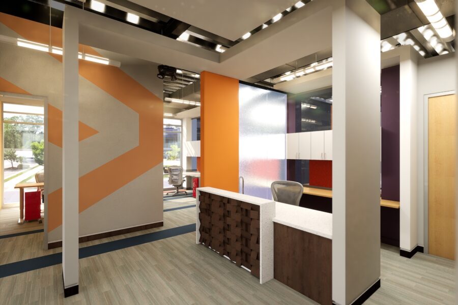
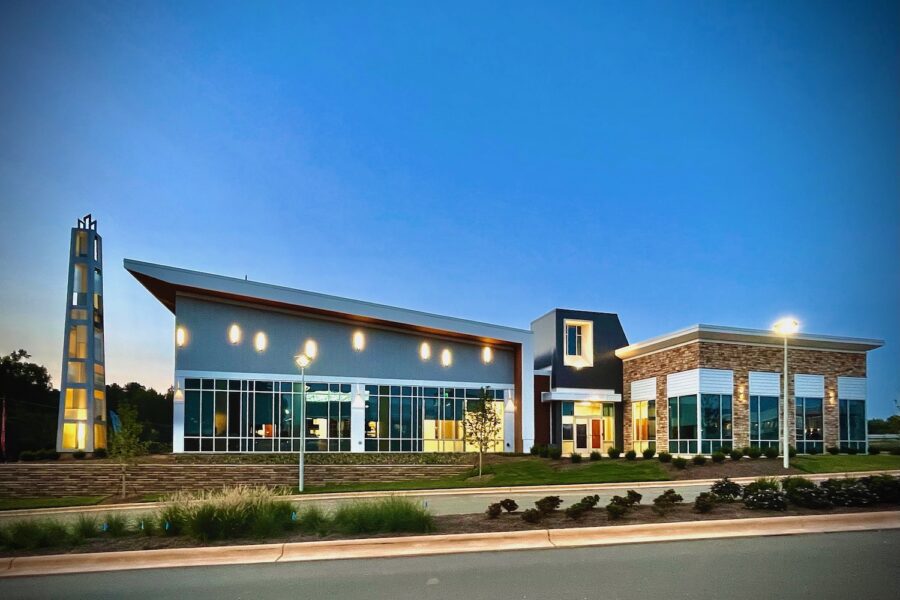
Since our founding in 2004, we’ve been known by our F with color blocks and brownish font. But in the last few years we’ve changed and grown and successfully designed a number of major Mixed Use and multi-family projects plus dozens of retail spaces and offices.
One key to our success is sticking to tried and true standards of construction combined with creative simplicity and attention to detail. This approach creates more cost efficiencies, better construction administration and fewer headaches for our clients. This year, we realized it was time to update our logo to better reflect who we’ve become. Our aim in the new brand is to reflect the creative, no-hassle approach we bring to every project.
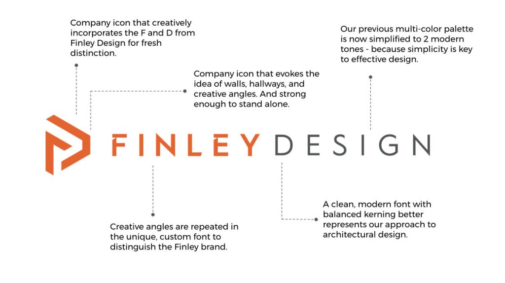 Compared with the old logo, the new one is lighter, cleaner and more contemporary. The custom Finley font reflects our creativity and the balanced spacing is clean, modern, and light.
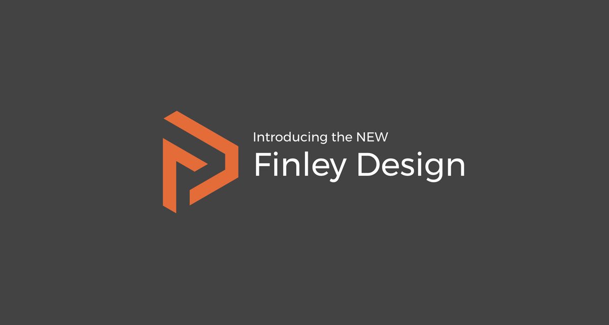
The logo mark represents the company name. If you look closely, you’ll see our F and D, but there’s so much more. The mark is stylized with angles to evoke the idea of walls, spaces and creative solutions.
We hope you like the new look and feel for Finley Design. Check out more brand updates—like an updated company brochure and our recently launched new website.
Planning new projects?
We’d love to be your architect of choice. Reach out to Kerry Finley and get the conversation started.